


Hungarian Coronavirus Website Is The Least Informative In The Region
- 8 Apr 2021 3:05 PM
- Átlátszó

Atlatszo.hu compared the official coronavirus information sites of Hungary with countries in this Region in order to find out exactly what kind of information is shared with the public. This special report concludes that a comparison in March of 14 countries shows the Hungarian Covid site was by far the least informative.
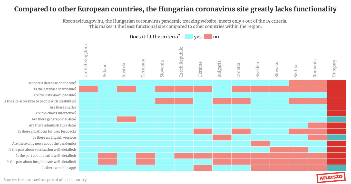
From the comparison of the 14 countries, the situation of Hungary is not very promising: it turned out that the Hungarian government shares the least data with its citizens. In the meantime, we could regularly read that according to the government, there is no problem at all with the provided data.
Most of the countries use the coronavirus information website to share up-to-date data according to the spread of the pandemic or to provide information about the upcoming measures or restrictions taken by the government. That’s why most of these websites use interactive charts or maps to illustrate the change in the daily statistics.
From the 14 countries that we examined, there were only one exceptions in this regard: Hungary. There were several problems with the quality of the pandemic statistics provided by the Hungarian government since the beginning: in many cases it later turned out later that something was wrong with the reported data, concerning the vaccination or the number of deaths.

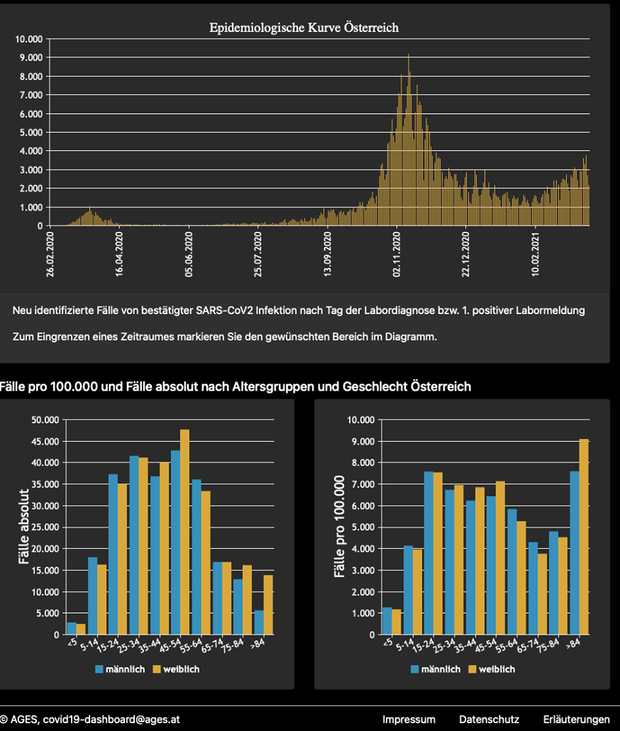
The best examples regarding the transparency of the information are the Austrian and British websites. On the Austrian portal, one can find several charts and statistics about the pandemic and there are several statistics about how the pandemic affects different age groups and genders. In addition, the websites also provide information on exactly how many beds are still available in hospitals.
The V4 countries, often mentioned by the Prime Minister are also much more communicative and transparent regarding the statistics: all three countries (Poland, the Czech Republic and Slovakia) illustrate the spread of COVID-19 and the number of registered new cases with interactive graphs and detailed data about each settlement.
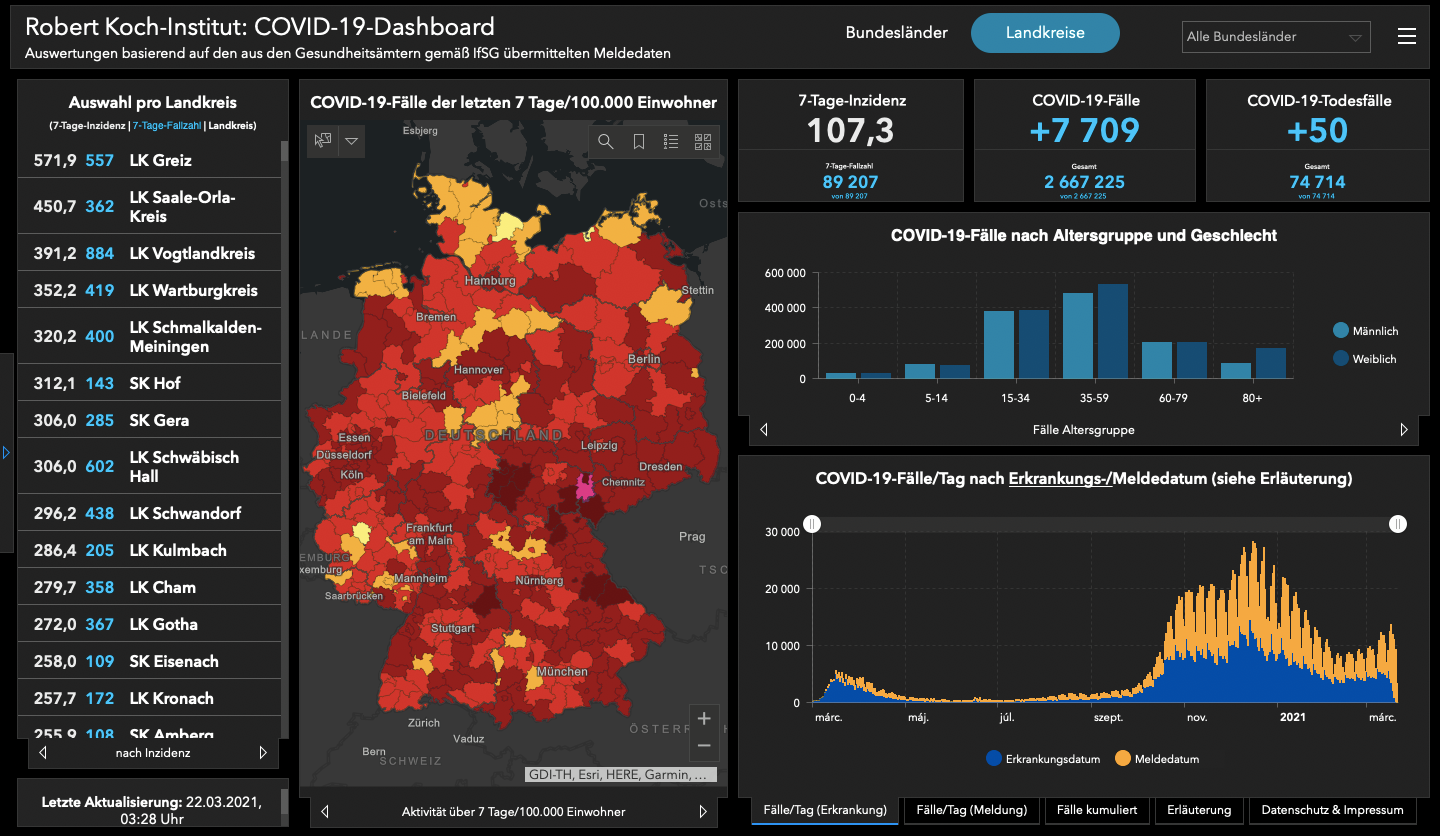
Germany can also be a good example to follow:
Contrary to all these countries, the official Hungarian website, koronavirus.gov.hu can only show off a mobile app, an English version of the website and a map where the spreading of the virus in the counties is presented but in the form of an image (png) file which is almost impossible to analyse.
Additional statistics, such as the number of active new cases or the tested, isolated, healed and deceased patients and recently the data about the vaccinations rollout are only available in a national level, so they do not reveal too much information about the spread of the pandemic.
In other words, while we see that in most countries, coronavirus information pages created with the support of the government, regularly share graphs, maps, and downloadable, data and statistics, while the Hungarian population is forced to look for other sources in order to find out more about the pandemic.
The officially available data on the epidemic was first published by the Koronamonitor of Átlátszó in a searchable format, and has been updated daily ever since.
In addition to the official information site, there are two other regularly updated pages in Romania: one which specifically shows the situation in Transylvania and one created by the Babeş-Bolyai University. In fact, while here in Hungary the unavailability of the data causes most of the problems, in Romania, the excessive transparency caused a scandal recently. The Romanian Ministry of Interior stated that the disclosure of the exact address of vaccination and test centers violated the interests of the national security.
The unavailability of Hungarian data is also shown by the fact that we had to wait one year to be able to see how exactly the virus affected the Hungarian settlements: the settlement-level data was brought to the public eye only in March not by the official information page, but thanks to a local NGO, K-Monitor.
However, there are much more serious problems with the Hungarian coronavirus website than the lack of transparency. Most countries use the epidemiological information page for what its name refers to, which means sharing information about the pandemic with data sheets, and functional, easy-to-understand charts.
It is unprecedented that the official information site is used by the government as a propaganda platform to disseminate its own narratives, but this is exactly the case in Hungary. The website which is supposed to inform the public about the measures of the government and other useful information about the virus, basically functions as yet another platform to talk about the evil George Soros and Brussels, or the supposed or real success of the current regime which are not at all related to the pandemic:

Translated by Zita Szopkó. The original, Hungarian version of this article was written by Krisztián Szabó and Zita Szopkó.
Cover photo: Comparison of European epidemiological information pages. The data visualization was made by Krisztián Szabó.
Article republished with the permission of the source: atlatszo.hu
XpatLoop Media Partner

LATEST NEWS IN current affairs